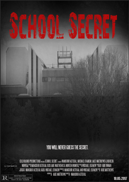
Firstly, prior to making my poster, me and a group member went outside to take pictures of our school and its surroundings as this was the setting of our horror film. Once i started to work on my poster on Photoshop, i intertwined two photos together, one picture was of the school and another was of a forest setting that was taken on the backfield of my sixth form. I then blended the two images together through the use of a feather and blend mode tool as well as opacity and brightness settings to ensure the picture of the school and the forest look like one picture. i then used a black and white image tool to make the overall cover look more dark and sinister which would help me produce an effective horror poster. I also used a black fill and mask overlay with a brush tool to add and infuse a dark atmospheric environment onto the cover, this added a mystical but conventional tone to my poster cover. Furthermore, i added an age restriction sign , release date and personalised credits on the bottom of the cover which adds authenticity to the cover and makes my poster look professional.


